GQ interviews Heated Rivalry costume designer Hanna Puley, breaking down Shane and Ilya’s sexy on-screen styling
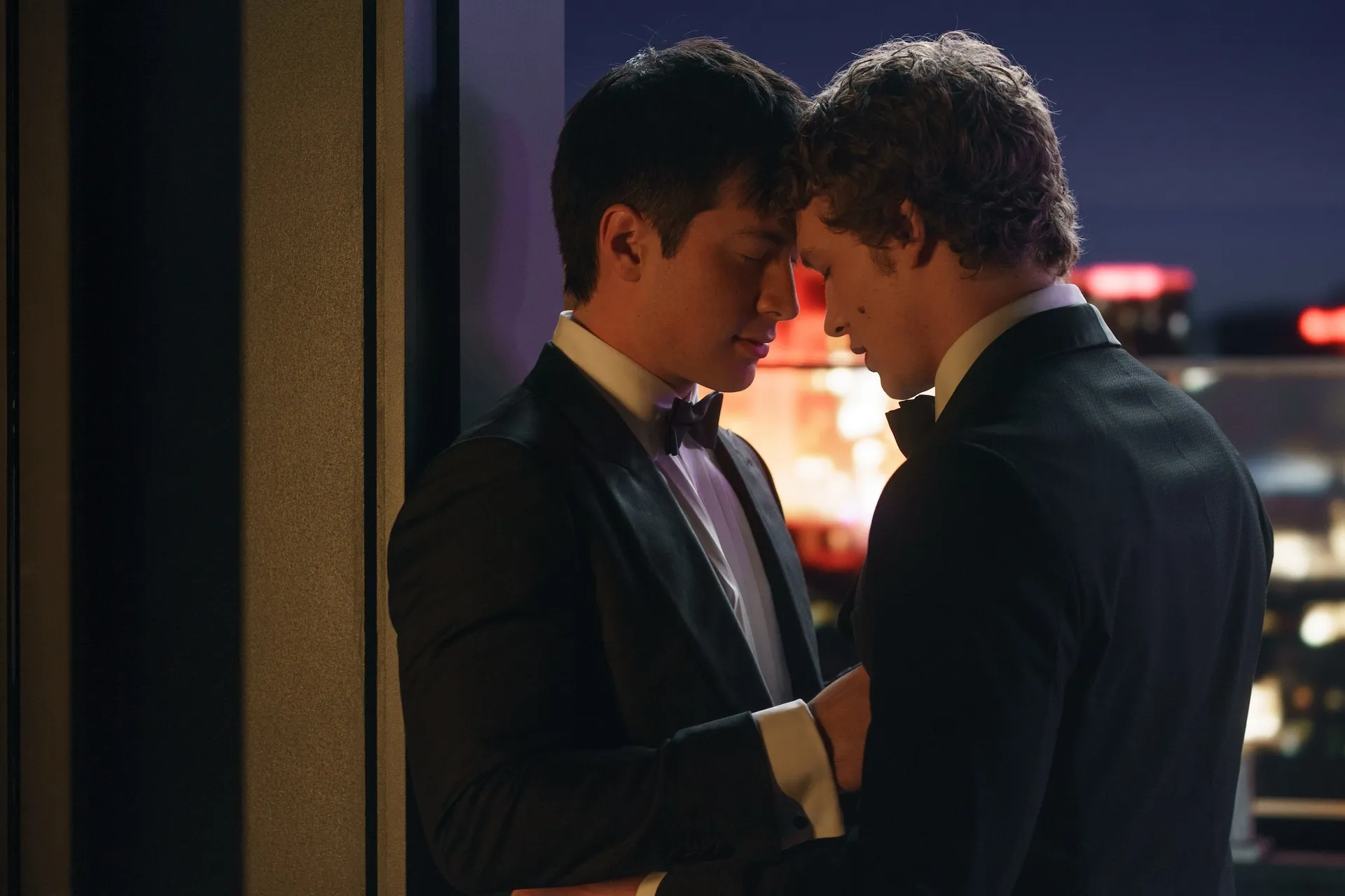
As more and more viewers have obsessed over the show since its November 28 premiere—it’s become a fixture among HBO Max’s top 10 shows in the US, and will begin streaming in the UK on January 10—it stands to reason that if the audience started watching for the six packs, they stayed for Shane Hollander’s hot-nerd reading glasses. You know, proverbially speaking.
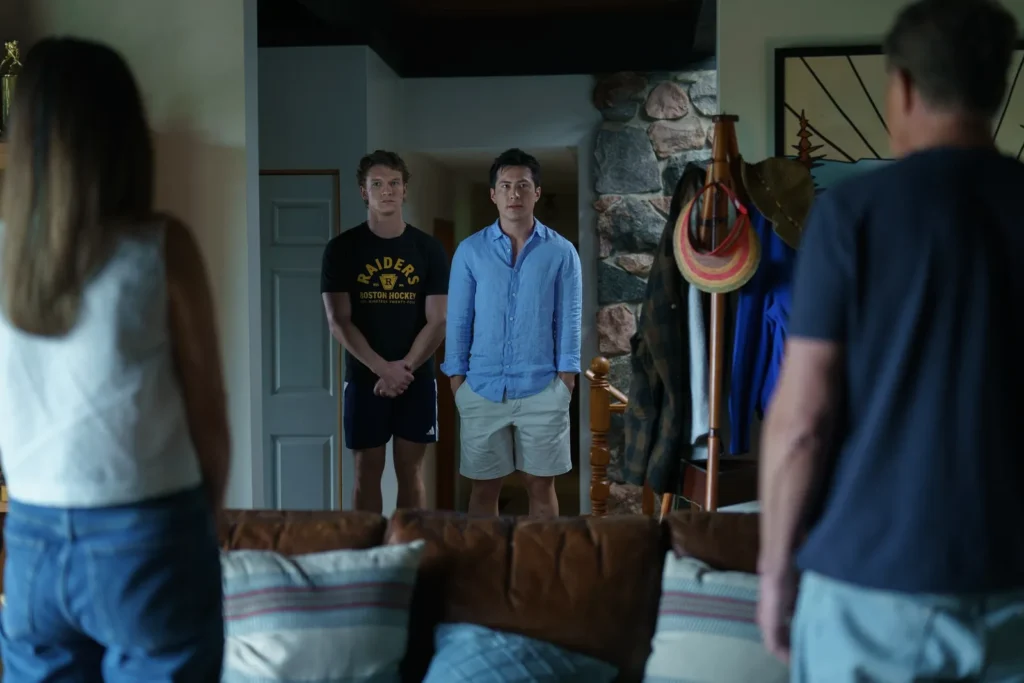
In late December, I spoke with the show’s costume designer, Hanna Puley, about a menswear-adjacent plot point—a scene in which Shane admits to hiring a stylist. (The scene in question takes place in 2017, at the dawn of the tunnel-fit era. Travis Kelce would be proud.) Partially given the show’s shoestring budget, but mainly due to the fact that its characters are closeted pro-hockey players who are dressing for gyms and locker rooms, most of the clothes on the show aren’t especially flashy. Shane is, by design, a hapless dresser; even the most diehard Heated Rivalry fans have dunked on his frumpy duds. Meanwhile, Shane’s rival-turned-lover, Russian hockey phenom Ilya Rozanov (Connor Storrie), boasts a new-money wardrobe of Rick Owens drop-crotch sweats and sexy Diesel tank tops.
Unsurprisingly, Puley had many other great insights to share about the show’s costuming philosophy. Read on for more of our conversation, in which the designer spilled on Ilya’s “Slavic man style,” Shane’s bookish eyewear, and those slyly suggestive team logos.
GQ: As someone who often has to write about famous men hiring stylists, I had a good laugh while watching episode five, when Shane tells Ilya that he hired a stylist. As the costumer of the show, what was your perspective on incorporating that little plotline?
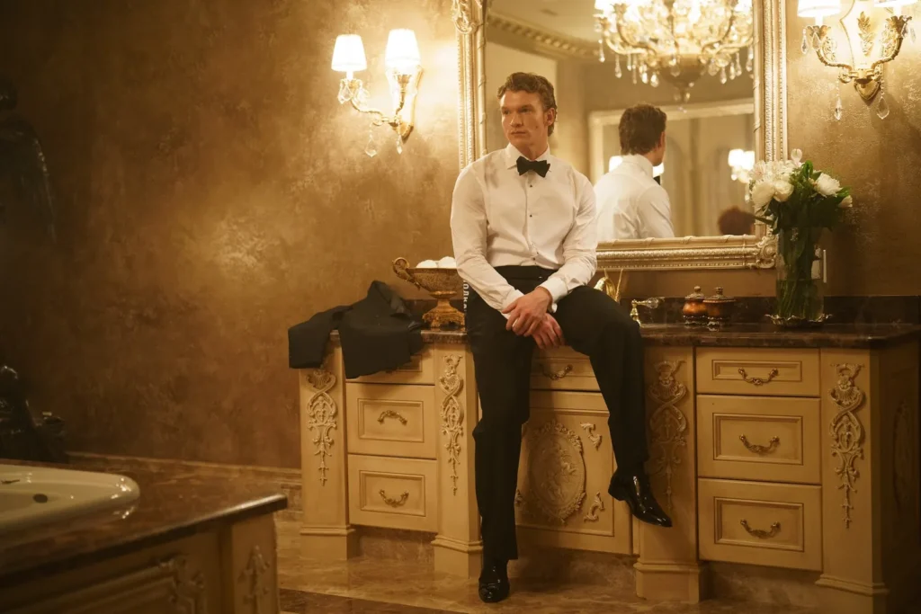
Hanna Puley: [Laughs] I know you mentioned the stylist point is the key because you guys are coming at it from more of a fashion angle, and that’s honestly not how I approach costume design. It’s not “fashion” to me. I wanted it to still feel like it was him, where it’s like the choices that were made were still him, and they’re kind of still boring, and they’re still very contained in this heteronormative mask that is so clearly the thing that he just feels comfortable in. When we see that shift, that’s the only time we see him in patterns. It’s the only time that we see him in something that’s not a black suit. His general style for the whole show up to that point is tuxedos, athleticwear. His “hot” look is the white T-shirt [in episode four’s nightclub scene], where he just feels the best version of himself. I think that I kind of leaned on that because it feels so identifiable with a lot of men that I know. This is their version of looking the hottest way that they know how to.
Very true.
Totally, right? Literally, they feel so good in just a good white T-shirt. Playing that for Shane was a choice for sure, and I leaned on it a lot, but I think it makes it feel really grounded because it is so familiar with a lot of men.
Yeah. It’s almost like a big personal jump for Shane, that scene in Tampa, even though it’s just a tan jacket and a black tee.
It’s actually a [full] white suit! [With costuming,] we create a whole story world that does get seen, all the sandcastles that we build in film. It’s wild. Even all of Kip’s friends, that birthday scene where Scott’s looking in through the window [in episode three]… Everybody looks so good, and then you don’t see anything.
Yeah, the plight of the costume designer is so…
[Laughs] I truly think it’s like we’re building sandcastles that then just get washed away by the sea. Sometimes you get to enjoy them a little longer, but usually not really.
Totally. Still, the simplicity of the look especially works because, of the two, Shane is the “brand-friendly” one. He’s the one who’s getting deals, he’s getting the Rolex partnership. It’s funny too, because Ilya is so much more inherently fashionable. I’ve seen a lot of praise for Ilya’s fashion online. People love his “Slavic man” style—the slides that he wears indoors, and the leopard Jean Paul Gaultier shirt at the club.
You can’t really see them—again, this is another sandcastle that we built—but we got him some leather slides and then lined them with fur and put these bejeweled clips on the front. We really went all out with Ilya because it feels like he’s the one who’s willing to take the risks. It’s just inherently in the culture a little bit more, I think. And also, he’s just out to provoke. The whole thing with the Jean Paul Gaultier shirt—I’ve been getting a lot of messaging regarding that too, because it’s such a statement piece. I don’t know that anyone else could pull that shirt off in the world besides Ilya. It’s just so identifiable and also metaphorical to me. If I can put in little things that speak to me visually [like] the sense of him being this skinned predatory cat. In that moment, he has no power. He just sees his love across [the room], and there’s nothing he can do. So you see this version of himself literally on his shirt, which is just skinned, lost all his power. But Ilya, yeah—I think one person made a little video about it, and it was the “Slavic fuckboy aesthetic” of the indoor slides, obviously the Adidas… It’s just funny how, to me, it was no question that it was going to be Adidas.
We’ve got some really nice basic pieces because I think that even if he is the most showboaty, there’s so much about just being comfortable as an athlete. With all of his tank tops, they’re Diesel tank tops and they’re higher end or Hugo Boss or leaning on stuff that would still be a little bit more of that ostentatious wealth, showcasing, showboating, always about how much money he has. There’s the Russian kind of thing [in the show] where it’s like the gold interiors, and everything’s a little ostentatious. That’s what we were playing with.
Especially with Ilya, it’s like, these are brands that this character would theoretically gravitate towards or purchase himself.
Or probably also have brand partnerships with. You could see [it like] this is all just stuff that they’ve sent him.
Exactly. You can imagine them both getting boxes of free stuff sent to their house. Like, “Alright, I’ll wear this.”
They’re like, “Ooh, yeah.” Which brands associate with who, it’s such an interesting marker of identity. What brands you lean on as a public figure. It’s all just psychology and perception and how people are impacted by history and then what the brands represent.
In your wildest dreams, what would Shane be wearing? What brands is his fictional stylist pulling?
I think that the stylist would be trying so hard to get him into different things, and he would just be like, “I don’t… I’m just going to…” There would be so much hesitancy because there’s just a lack of comfort, so even having someone say, “This is great. This is so cool.” Wildest dreams for that, I think it’s just leaning into color and showing body more publicly. My feeling when I’m designing people and working with actors is when they feel the most comfortable, they look the best, when they look the most confident in what they wear.
The Shane thing is interesting because I think there’s just so much discomfort in the character himself, in the world outside of being an athlete. Like, Hudson is doing that great. [Laughs] Hudson and Shane are very different people. What a great thing for him that people are really seeing what a wonderful job he did on screen for the show. Connor, too—very different people than the characters they play. But yeah, Shane, I don’t think we could get him to go much further. And then, cut, I have him in very straight-cut suits, a little bit of tailoring, but nothing crazy, really simple lapels for all the tuxedos. Ilya’s tuxedos, we did double-breasted and peak lapel and different colors and played around with that a little bit more. I think it’s all just about trying to tap into the real character beats. Shane, I think, just doesn’t exist in the world that way.
Speaking of Shane, there are two notable pairs of eyewear in this season. He and Kip both wear reading glasses, and they’re both really good. One, do you recall where they’re from?
The brand? I don’t think it’s anything fancy. Hopefully with season two, we can get some brand partnerships and I can get some great stuff… Because our budget wasn’t huge. We were working with a relatively limited budget in terms of high-end [pieces], so I was trying to be really strategic. I was like, “The glasses, as long as they look like the right shape…” That was actually for Shane’s glasses particularly—we had to go through, I think, one of the executive producers to make sure that she could sign off because she’s a huge fan of the books, so it needed approval. Whereas most of the other stuff, it was me being like, “I think we should do this,” and Jacob [Tierney, who wrote, directed, and produced the show] saying, “Tweak a little.” But generally, I had a lot of freedom to do what I wanted.
And then the glasses were a real sticking point, and I tried probably about 10 to 15 pairs, especially for Hudson, for Shane. For Kip [played by Robbie G.K.], I was like, “These feel right.” We didn’t need to try as many because I had one that felt like, “art-history student” that could work for him. But yeah, for Shane, I had a case full of glasses that we went through because you just have to have them. I remember we tried them on set and had everybody be like, “Those ones.” Yeah, these things are important because they’re in the imagination of the people reading [the books by Rachel Reid, upon which the show is based]. They’re visualizing it and wanting to get [a pair] that kind of felt classic, but also nerdy in a way, and maybe a little bit outside of that athletic persona of who Shane is.
Yeah, Shane’s glasses are that clubmaster-style, super bookish.
Yeah, and maybe give a little bit more depth, more variety to who this person is. Because if you lean too much on archetype, you lose the details of the individual person. So, trying to find the little artifacts that we can sprinkle in and make him a little bit more grounded and real.
Were you a part of designing the logos of the hockey jerseys? Because I’ve been hearing about those, too.
That was a team effort. Actually, our graphics guy, Stephen Crowhurst, he was amazing. He did the logos. He would do multiple options and then we would all talk about it, but there was definitely the intention for innuendo I think was there from the beginning, and it’s so fun. The show is so fun because there’s so much space for it, and people are starting to clock into what the different things look like.
I honestly didn’t notice until I saw that interview and I was like, “Okay, that’s really funny.”
I know, I know. We’ll see about the future teams. I know we’ll have Ottawa, for sure, I think, for season two. Yeah, the logos are amazing. We all were very collaborative for those kinds of things that impact everything because it’s jerseys, they had to do the locker rooms, they had a carpet made. All of these things that kind of are cross-departmental, we would have multiple conversations about early on. It was cool to see this and giggle as we went about making all the little things that we had.